July 2025 - Mar 2026



Arth Verma
Lead Product Designer
The real challenge wasn't any single screen, it was three mindsets at once: the player chasing a dopamine hit, the floor manager who needed speed, the operator who needed to trust the data.
About the Project
Rewarvo's stakeholders identified a gap in the arcade, casino, and VGT industry: loyalty tools were fragmented and inaccessible to the non-technical staff running them daily. They brought me in to solve it from the ground up, starting with research, not a spec.
The platform connects three key stakeholders:
1. The Player:
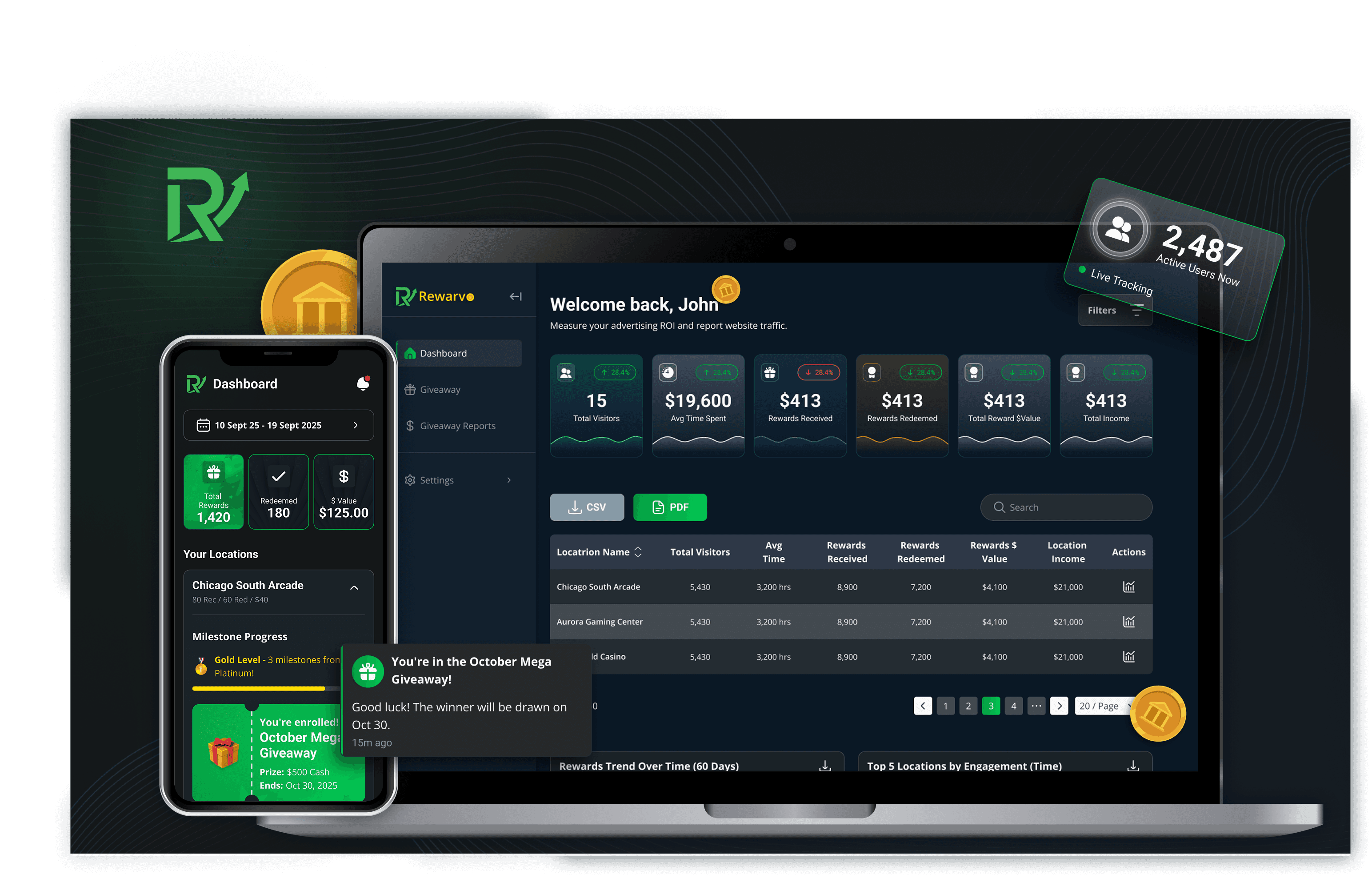
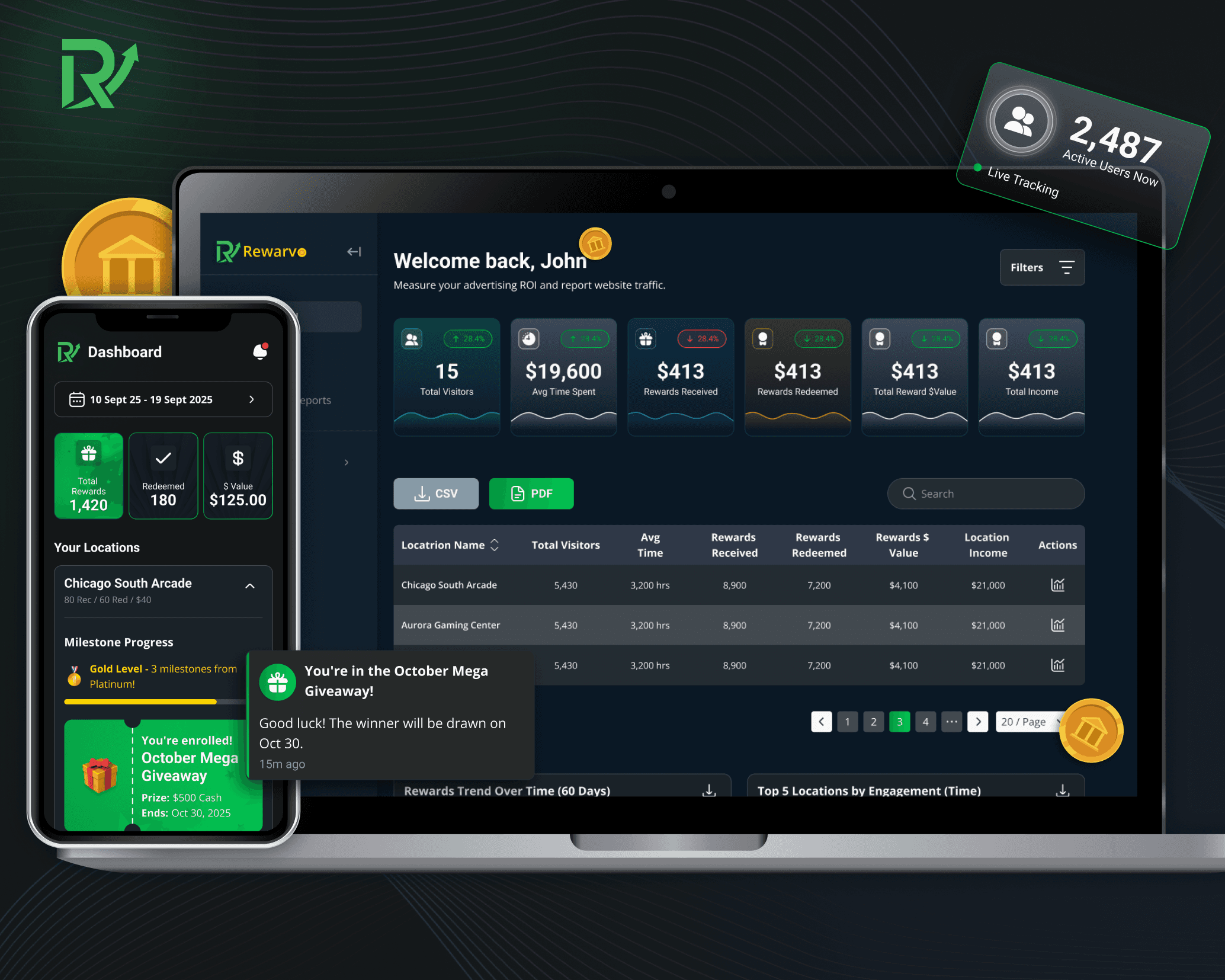
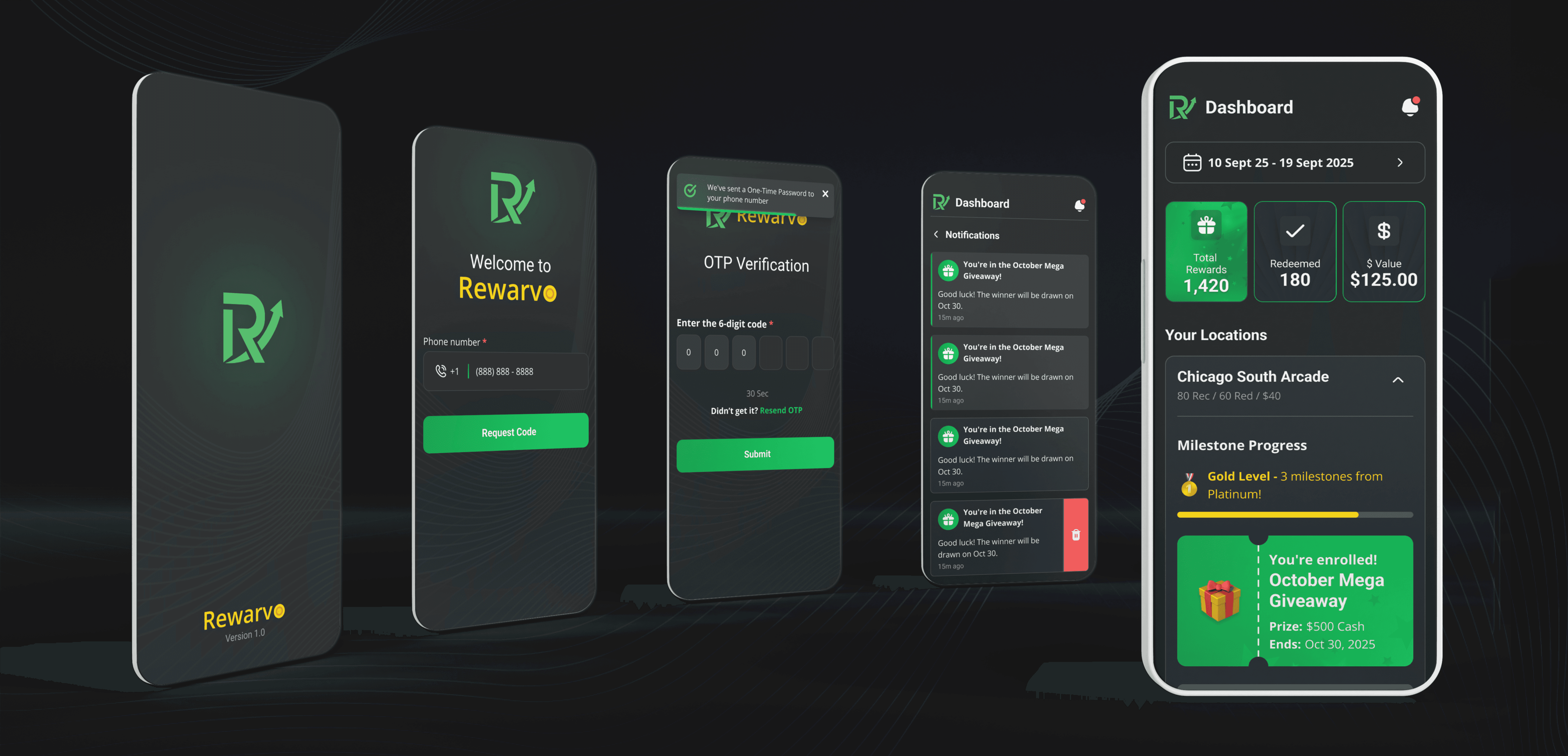
mobile app for rewards and giveaways
2. The Location Manager:
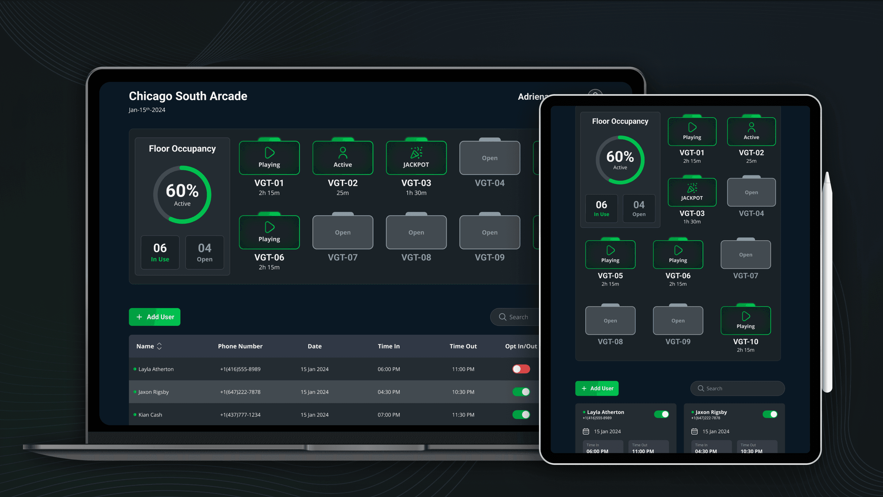
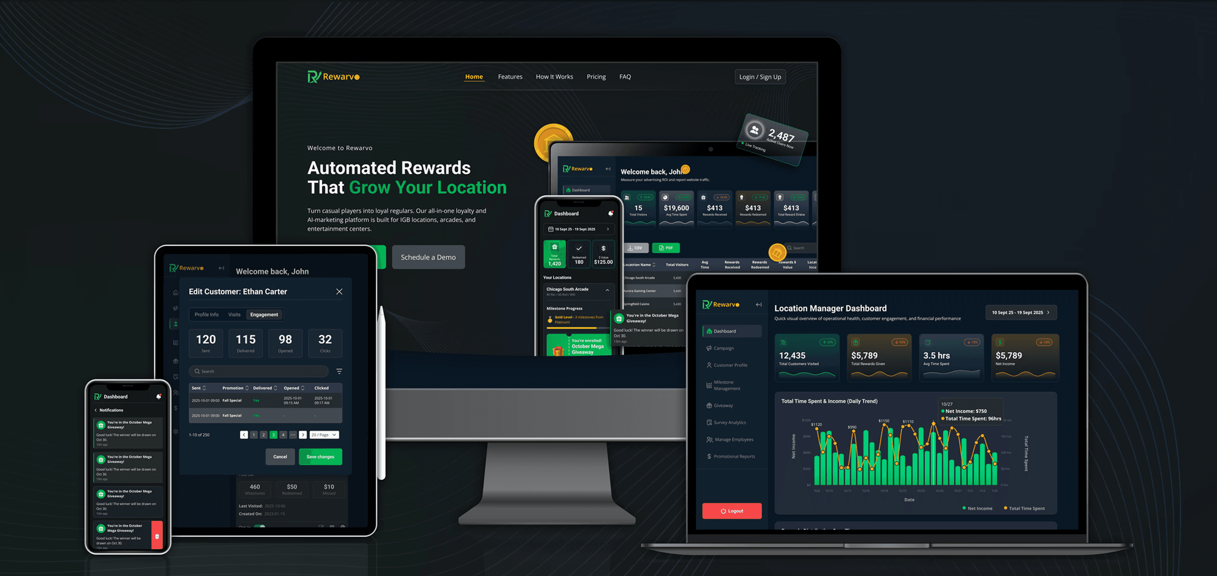
terminal for daily ops and winner verification
3. The Terminal Operator:
dashboard for monitoring multiple locations
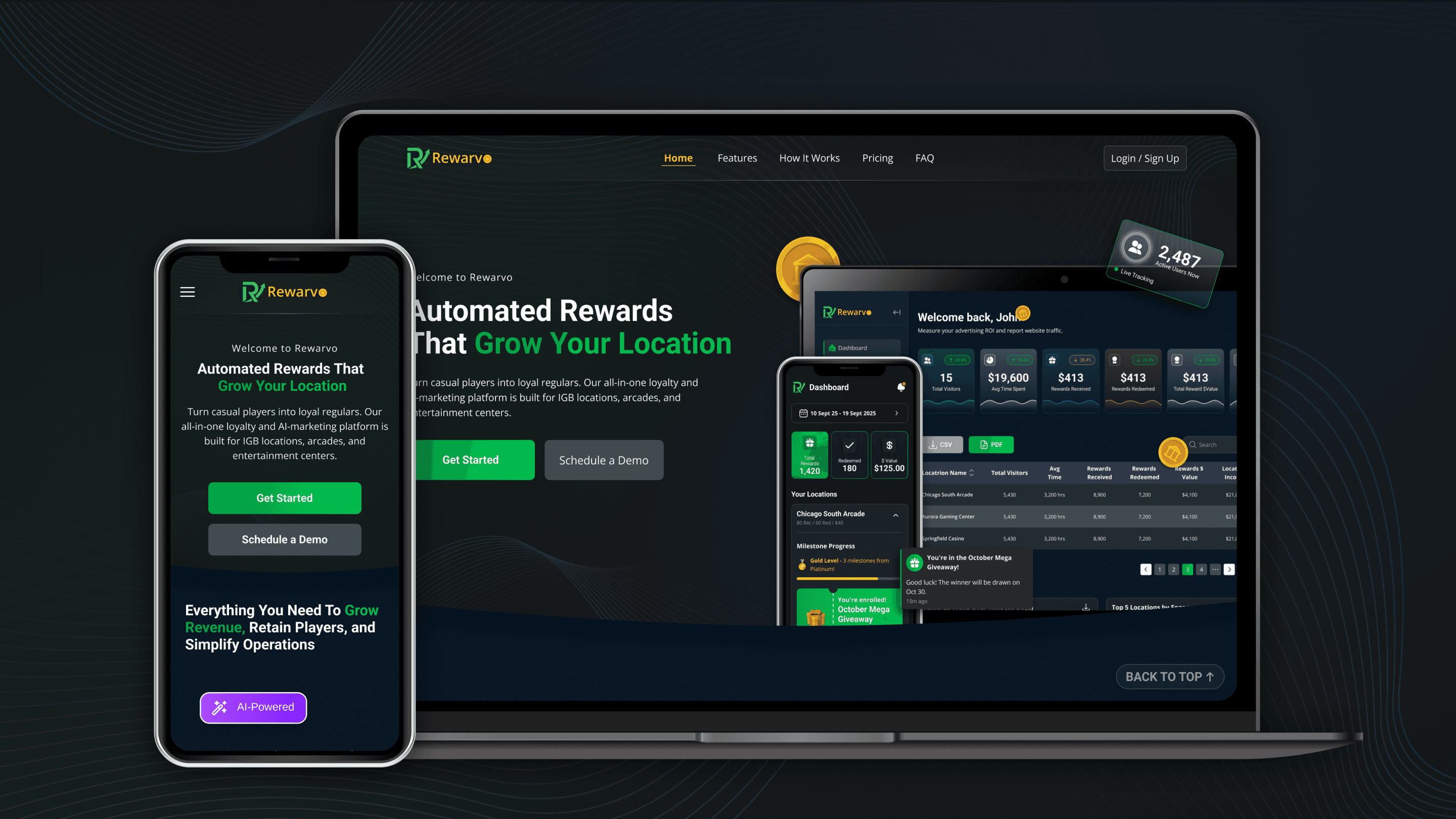
A Quick Glimpse at the Final Product
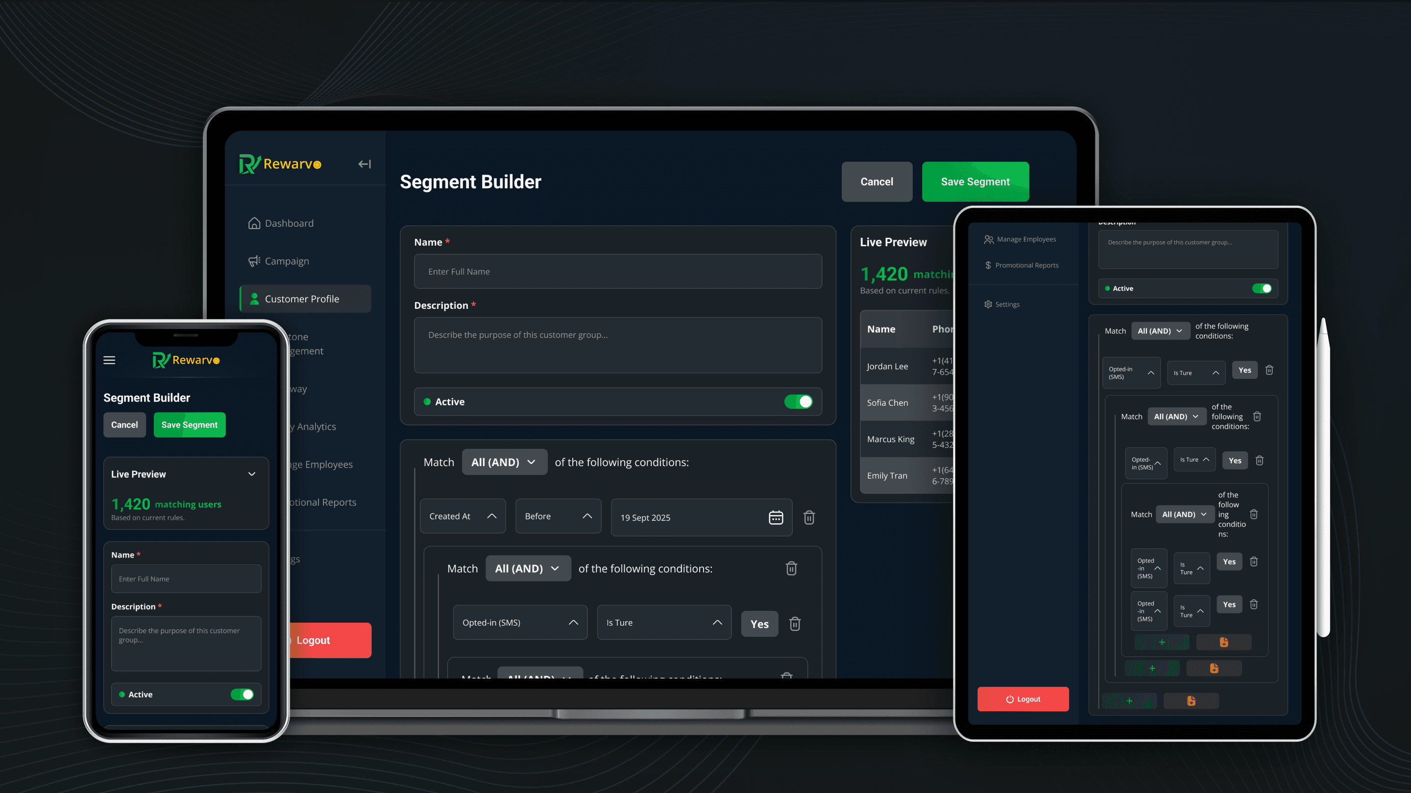

The Problem
Designing for Divergent User Needs
Addressing the needs of multiple user groups in a single product.
Friction in Floor Operations
Floor staff needed to verify winners in seconds, often in low light, but data was buried in hard-to-reach places.
Data Overload for Operators
Owners needed both a fast high-level scan and a granular drill-down, in the same interface.
Research
With a limited research budget as an early-stage startup, I prioritized research that would directly de-risk decisions, competitive testing, on-site staff visits, and structured prioritization, over a lengthy formal study.
Empathy Map
I built a picture of Leo, her habits, frustrations, and what would bring her back, so player-facing decisions were grounded in a real mental model, not assumptions.

User Journey Map
I needed to know where she got stuck. I traced her full path from discovery to retention to find exactly where friction lived, so fixes targeted real drop-off points, not guesses.

Competitive Research
Before any screens existed, the location owner stakeholder wanted proof the market gap was real, not assumed. I benchmarked three direct competitors to see where existing tools held up and where they didn't, so every decision that followed was grounded in what the market actually lacked.

What Research Surfaced
Insight 01: Onboarding complexity causes abandonment
Leo doesn't want to carry a physical card or fill out a form. Sign-up needed to be phone-only.
Insight 02: Instant gratification boosts player engagement
Any wait in line kills the moment. Redemption needed to be one tap, not a queue.
Insight 03: Integration between different user portals was essential for product differentiation
No competitor combined a real player app, dedicated floor tools, and multi-location analytics in one system. That combination became Rewarvo's core differentiator.
My Approach: Mapping the System Before Screens
With four distinct interfaces, the hardest part wasn't any single screen, it was that every role's experience was entangled with the others. Working with the location owner stakeholder, I mapped every feature and flow across all four roles before wireframing began, surfacing dependencies early: giveaway logic on the operator side directly shaped what the owner needed to configure.

Brand Exploration
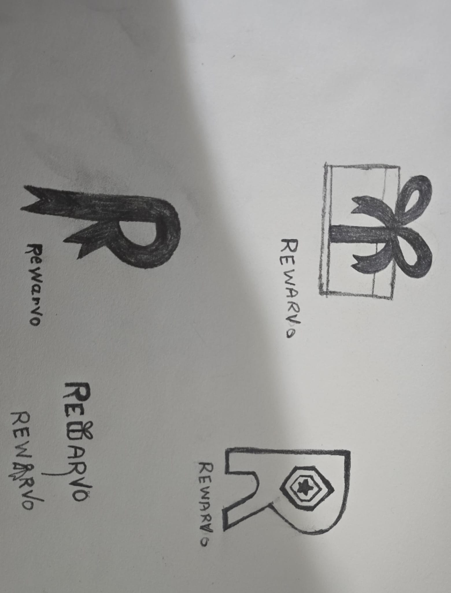
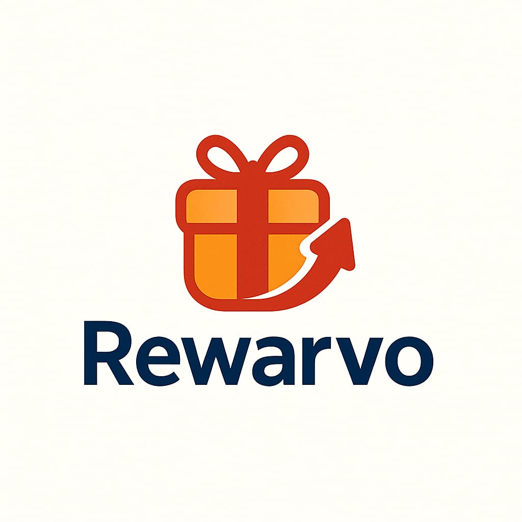
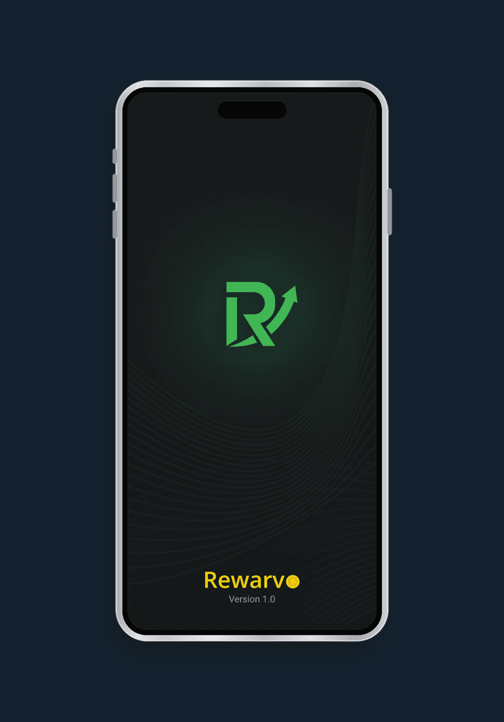
I designed the app's logo, exploring how "reward" and "growth" could coexist in one mark.

Moving Into Design
User Flows
I designed 3 distinct user flows corresponding to the 3 personas to show non-design stakeholders what features and functionalities were essential for each user type.


Idea/Concept Prioritization
I worked with stakeholders to rank every feature against real user friction and business cost, not just what seemed technically feasible. Floor staff tools shipped first because that friction cost the business the most, daily; the segment builder moved to "later" because its complexity outweighed the value it delivered at this stage.

Visual Direction - Moodboard
Premium and energetic, closer to a casino floor's excitement paired with a control room's reliability. Dark surfaces, gold for reward moments, cool tones for speed.

What I am Proud of
Dark mode was my decision, not a stakeholder default.
These screens live on arcade floors, low-light environments where a bright UI causes glare, and dark mode matched the premium, gaming-native feel the brand needed. From there, I built a 100+ component system with every state defined, so the app and every dashboard shared one language.

Designing for complex permission logic.
Floor staff and managers needed different access to the same Edit Employee modal, so I built that logic into the fields themselves, validated in interactive prototypes before code was written.

My Core Contributions
The gamified mobile app
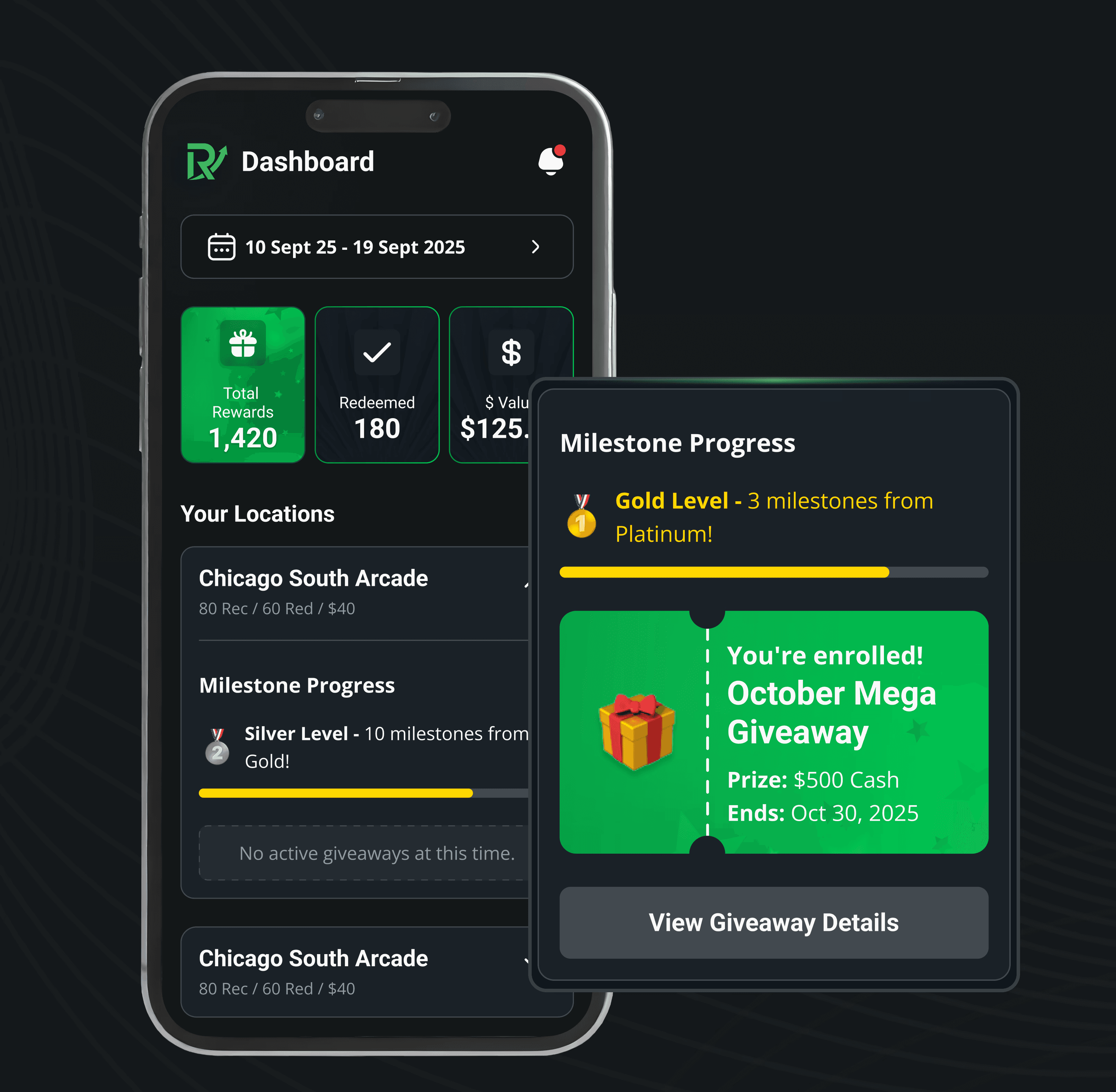
Small, frequent wins, radial progress bars, ticket-style redemption, and tiered accents that turn every level-up into a visible moment.
The landing page
Built around live product data instead of claims, so operators could see the platform working before a demo.
Testing & Iteration
An early version showed raw point totals ("1,240 points"), but a number alone doesn't tell a player if they're doing well. I replaced it with a five-tier system, Bronze through Diamond, giving players an instant, familiar scale with room to keep climbing
Challenges & How I Handled Them
Low-cost alternative for the segment builder
The original concept called for a fully flexible, drag-and-drop rule builder. I designed a simplified version instead, reducing the condition types and removing saved templates, while keeping the core interaction intact: a clear, guided way to build a segment step by step. The design still solved the underlying problem, just through a leaner set of controls rather than an open-ended logic editor.
Outcomes & Impact
System Scale
100+ reusable components and 120+ prototypes, with every state defined before development began.
Development Impact
~30% faster development, with fewer revision cycles and earlier validation of design decisions.
Process Reliability
On-time delivery throughout, with daily stakeholder and engineering alignment.
Reflections
Mapping dependencies before wireframing was the single best decision on this project.
Four roles, one system, and it would've been easy to design each in isolation and discover the conflicts mid-build. Sitting down with the location owner stakeholder and mapping every feature side by side, before touching a screen, caught things like the giveaway logic dependency while it was still a conversation, not a rebuild. I didn't expect how little rework that would save later.
A lean budget forces honesty about what actually de-risks a decision.
No multi-week research phase meant every hour had to earn its place, competitive testing and floor visits targeted real unknowns, not due diligence.
What I'd Do Differently
Push for structured usability testing earlier
Even two or three moderated sessions, before assumptions get baked into the design system.
Scope the segment builder's real complexity with engineering sooner
So the ambition-vs-timeline tradeoff gets made with full information, not after the feature's already designed.
Trickee
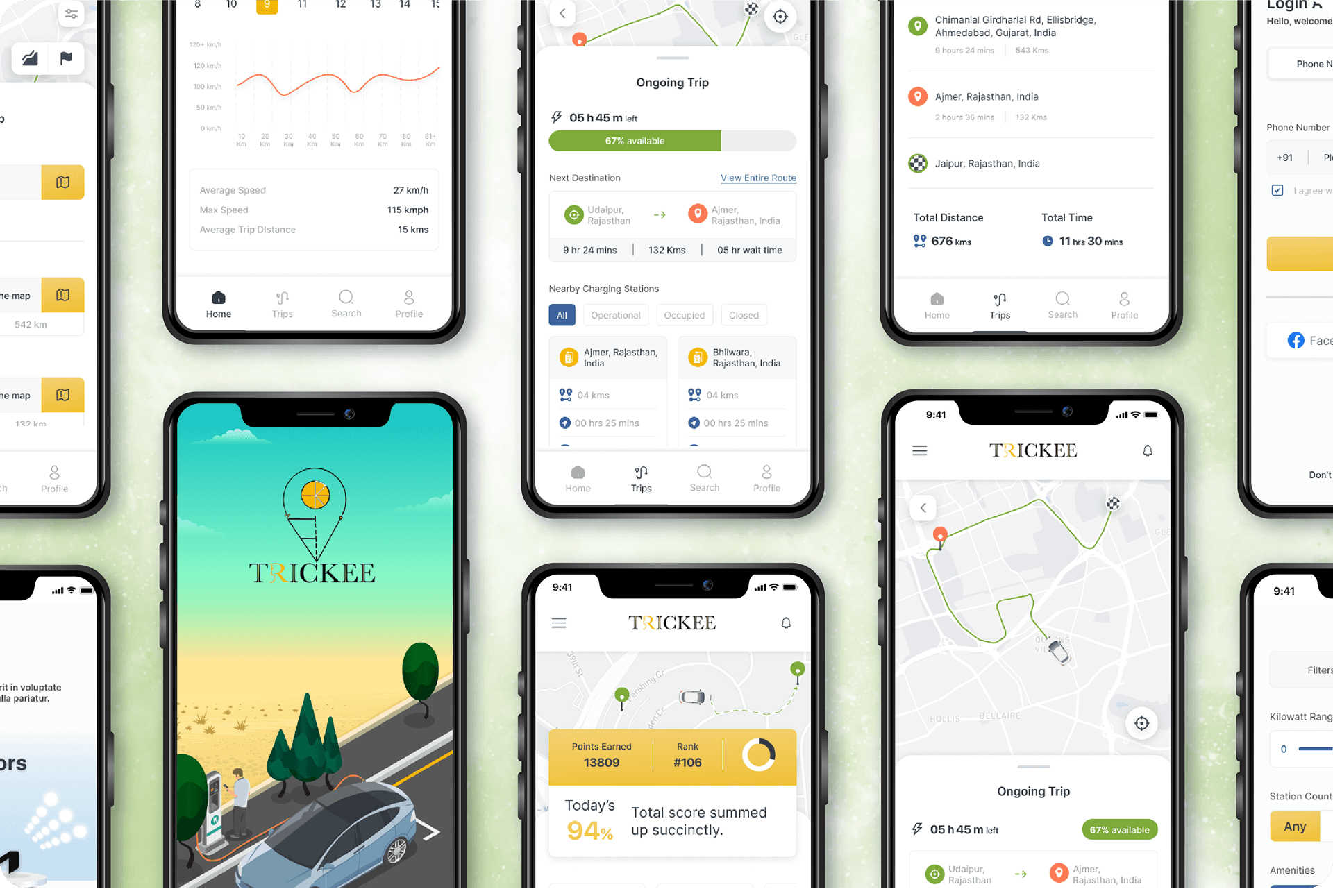
Trickee is a comprehensive mobile app designed to be the ultimate co-pilot for electric vehicle owners. It simplifies EV ownership by tracking vehicle health, scoring driving habits, and providing smart route planning with optimized charging stops to reduce range anxiety.
UI/UX
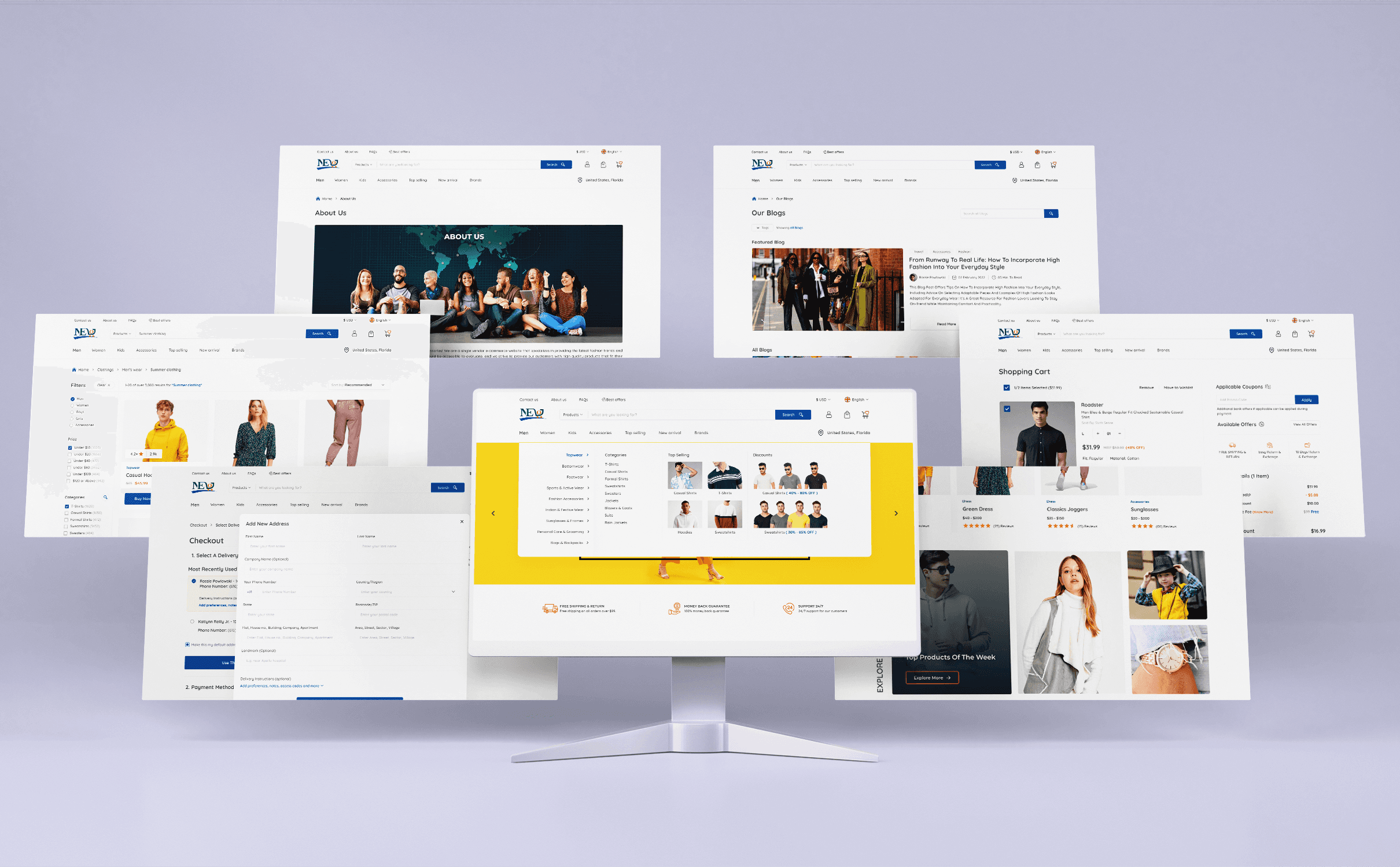
NEO
NEO is a modern e-commerce platform where users can also become sellers, designed to improve upon the standard online shopping experience. Its design philosophy prioritizes a frictionless user journey, starting with a prominent guest checkout option to welcome new customers.
UI/UX